If you've been following my Dribbble account you've probably already seen me post some artwork for a game called Junk ET that I've been contributing to since January 2015. It's a roguelike about a waste removal agent who cleans up junk on various planets. The dungeons are completely randomized, so no two playthroughs are ever exactly alike. I've neglected to post about it here until now, but I'll try to change that! If all goes as planned, the final version will be released this summer. I'm working with an awesome team of people and couldn't be happier to be a part of this game.
Last week I worked with one of our programmers on one of the game's main menus. You click on different parts to access other sub-menus, like character statistics or game settings.
Different areas have some slight animation as well -- some done through code, others handled by yours truly. We want the room to feel like a lively mission control type of place where employees monitor agents like the player's character.
Here's a close up of some animation I did for the employees at the front desk.
Showing posts with label Environments. Show all posts
Fire With Fire: Additional Tilesets
Been a while since we've seen one of these. Really the same tiles as the old set, but it's like the leaves are turning for fall.
I did make an actual new one though.
A slightly spookier set for October. Here's a quickly thrown together mockup to show you how they look on an actual field.
Labels:
Environments,
Fire With Fire
The Only Certainty at Norwich Indie Game Expo October 11th - 12th
Alright, so a lot's been going on with TOC of course. Since the game's beta version is being showcased this weekend at Norwich Game Expo soon I figure this is a good time to catch up!
The biggest recent development is that we have a composer on board by the name of Mark Allsworth. His music is astounding to be frank, and sometimes I still can't believe we're lucky enough to be able to collaborate with such a hard working musician. He's already provided sound for the game's beta and we're just happy to have him on the team! We're really hoping he'll stick around and provide the entire soundtrack for the finished game.
Other than that, Harry and Jon have been ironing out bugs and cranking out better and better builds of the game as always. Do those guys ever sleep? I've been working on a few other assets to place in the environments and UI.
A few icons for the Galaxy Map, which is where you'll jump between Systems (think of a System as a 'room' or 'stage', you'll be exploring these throughout the game).
Additionally we have some colossal space architecture in the form of Research Stations and Drone Relays. Much bigger in game but shrunken down here to avoid crashing people's browsers.
Last but not least we've polished up the way dialogue works and looks. We've whittled it down to a text box in the lower left, where a portrait of the speaker is displayed above the text. That's Midnight, your AI companion in the story. I'll write a little more about him later in the week, but in the future I'm hoping we can implement animated character portraits as well!
I've been working on some promotional illustrations for TOC as well, which I'll show soon as well. They'll be given away at the booth on Saturday--make sure to drop by for free stuff and the chance get your hands on the beta!
Labels:
Animation,
Environments,
User Interface
TOC: Electrical Storm Process
Another environment hazard, like the Nebula. This one's a little more dangerous if you couldn't tell.
We basically needed an animated storm cloud to be placed around certain levels. At first I considered a more rounded direction for the appearance, but ultimately I wanted it to look much different than the Nebula since they're 2 separate hazards. Opted for something a little more angular and hostile looking.
Truth be told I had no real idea of how to animate a cloud, so I looked up some reference first in the form of time lapses depicting storm formations.
After watching these a few times, I realized that it would take a lot of frames to get a realistic billowing effect for clouds. Even at such high speeds, you can see that in these videos the clouds still move pretty slowly. I didn't want to waste too many frames on this single animation since the game no doubt will have many more to include down the road.
Ultimately I figured it was best to forego realism and focus on communicating the overall 'idea' of a cloud. Even if the movements weren't as smooth as an actual cloud mass, I could get the basic movements of the clouds, the flashes of lightning, and the proper tones of grays to get the idea across to the player.
Everything was drawn first in Illustrator, then broken up into separate files according to how they would move and imported to Flash. I knew the bottom layer would comprise the main mass and move subtly as a unit.
Also had a separate file for little cloud bits here and there, which was something I took note of from the time lapses.
Yep. Just a plain old square...
These were imported into Flash where tweening makes small movements like the subtle up and down motion a breeze.
I wanted some to be affected by the bolts of lighting. In order to do this, I made a copy of the appropriate clouds with slightly different shading in Illustrator, like so:
And layered the lit up cloud over the normal one in Flash. When the animation was on a frame where lightning was nearby, the lit cloud layer was turned on; otherwise it was made invisible. Kind of like an on/off switch.
Put it all together and you have a lightning cloud! I hope you've enjoyed this wall of text, and maybe it's even given you some ideas you can use in the future. :D
Labels:
Animation,
Environments
The Only Certainty: Junk Tiles
Another tileset! I should be really good at these by now, but.
Basically these will be pasted together to create terrain hazards comprised of floating space... junk in various levels of the game. When you travel across it, it slows down your ship and you'll begin to take gradual damage after a while. Annoying.
Once again the real challenge was getting the borders to line up for a variety of tile shapes. Here are some examples of what we could make with these, though.
So basically we can form almost anything from long 'walls' to winding belts.
The purpose of this tileset (as well as the nebula) is to act as a sort of deterrent to guide players in a certain direction throughout levels. We opted to use an obstacle you could pass through if you wanted rather than actual solid walls because we don't necessarily want to forbid players from accessing areas they want to explore. Exploring is kind of the point of the whole game, so we feel you should be allowed to go anywhere you choose--but not always without consequences.
In this way players have more control over how they get from point A to point B. Instead of navigating the twists and turns between terrain hazards, you can choose to travel straight across debris, nebulae, and other obstacles and probably reach destinations much faster, but the path is a lot riskier and you'll likely take some damage. And in this game, there are no saves to fall back on if you're defeated. You can Save and Quit if you want to suspend play and resume your file later on, but if you get a Game Over, that's all folks. So we're trying to strike a balance between safer routes for people who want to take their time and more challenging paths for players who are more into that sort of thing.
Labels:
Environments
The Only Certainty: Nebula Tileset
Another tileset, been a while since I've done one of these.
Basically thick areas of starforming regions placed around levels. The idea was to create an environmental obstacle like fog that would impair your range of vision when you collided with it, so I made the nebula tiles somewhat dark and hazy looking. There are 9 basic tiles (North, East, West, South, Center, plus the ordinal directions) but some have slightly modified duplicates in order to line up with other tiles seamlessly. The biggest challenge was getting the different parts to connect together, but here are a few examples of the shapes that can be made with the tiles and I think we can manage a fairly good variety of shapes with what we have for the moment.
Labels:
Environments
The Only Certainty: Deep Space
Next step I've been working on recently is a backdrop for the levels in the game. The game is predominantly set in space, so for the most part they will look like this, mostly dark and dotted with stars. The above is the old version we'd stuck in just to have something to use.
Here's the updated version below:
Much less pixelated and it tiles seamlessly. We'll be setting the player, enemies, objects, UI, and all of the other important stuff over this.
Also, just for fun I messed around with what an animated version would look like.
I was watching A Trip to the Moon (1902) for ideas and was reminded of how there's a kind of flickering you see in really old films. I don't know, it might be too distracting in regular gameplay, but I would love to incorporate some kind of effect like this in the game's menus or especially the story cutscenes.
Labels:
Animation,
Environments
Seamless Tilesets in Illustrator: A Primer
Spent time over this weekend working on the second attempt for these tiles. They seem to have turned out OK, we'll see if they can be implemented into Fire With Fire smoothly though. Fingers crossed!
In the meantime, I thought I'd share a little bit about making seamless tiles using Adobe Illustrator. I used CS4 if you're curious, but I don't think the version will matter that much. This is pretty basic stuff we'll be using.
A lot of tilesets you see in older games like Fire Emblem or the Legend of Zelda are done in a pixel art style--no anti-aliasing.
I actually think such a precise method of working at a small scale makes it a little easier (a little) to make seamless tiles, since there's less room for error. The more pixels you work with, the more likely you may be to run into trouble lining things up perfectly.
But what do we do if we want tilesets with bigger anti-aliased shapes and patterns? Let's take a look. Fire up Illustrator.
First things first. Decide how big you want your tiles to be. In this example, I'll make the tiles 200 x 200 pixels for clarity's sake. So let's make a new canvas in Illustrator with those dimensions.
Now we're all set up with a canvas. But a blank slate won't do us much good, so let's start making a pattern for our tiles. Plop any old shape down--just make sure that it crosses one of the borders of the canvas. This border is the "seam" that we'll be looking at in order to get repeating patterns to line up perfectly.
Alright. Now when we make tiles out of this canvas, what we want is for the right side to line up perfectly with the left so that it appears continuous horizontally. Right now, the right half of the tile is taken care of, but how do we get a perfect match on the other side?
Make a copy of the shape you chose.
Now we're going to work on moving the copy to the correct position for seamlessness. Is that a word?
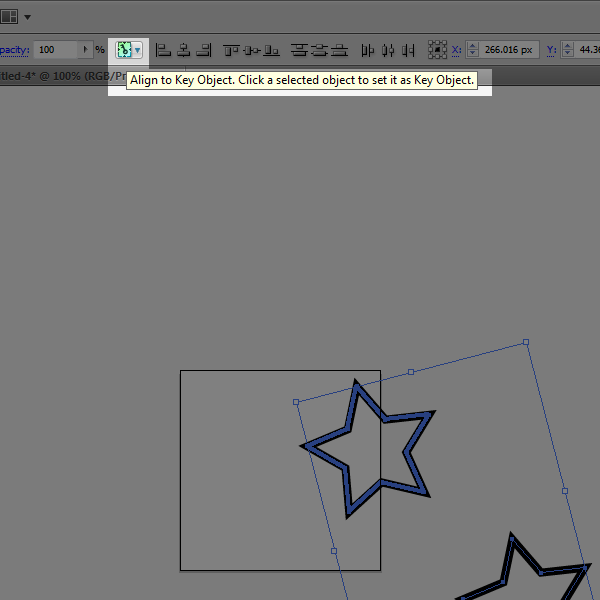
Select both shapes at once. You can left click and drag a box around them both, or left click one then Shift click the other. Just make sure both are highlighted as shown below.
This part might be a little tricky, so bear with me. Now that both shapes are selected, left click once more on the shape sitting on the canvas border. If done correctly, that shape should have a slightly bolder highlight than the other.
What you've done is made the border shape a Key Object for alignment. This is important for getting the exact positions we'll need for both shapes to 'connect' to one another once we've made tiles out of this.
Basically, it tells Illustrator how to align shapes when you use Alignment options. You can also align things to the Artboard (or canvas, same thing) or to a Selection (group of shapes). But with Align to Key Object, all other shapes will be aligned based on where that Key is.
So the next step is to start using these Alignment Options. They should be at the top of your screen.
But if not, you can show them by going to Window > Align on the top options bar. You'll see a window with different actions like 'Horizontal Align Left' and so forth.
Make sure both shapes are still highlighted, with the one sitting on the border made as the Key Object (slightly bolder highlight). Let's select Vertical Align Center from the Align options. The shape on the edge of the canvas is our Key Object, so that won't move. The copied shape should move so that it lines up with the Key. Demonstrated below.
Now let's do Horizontal Align Center. Again, the Key Object won't go anywhere. At this point, the 2nd shape should be in the exact same position as the Key.
Alright, now both shapes are sitting in the same spot. Click outside of the bounding box to deselect both of them. Click on the overlapping shapes once more--by default, Illustrator will only select the one sitting on top. So you should only have one of the two shapes highlighted (though you can't really tell by looking at them. If you want to be absolutely sure, you can always check the Layers window to see what shapes are selected. There should be a colored indicator next to any object you've selected--in this case, only one of the two should be.)
Now we're going to move this top shape again. At the top options bar, go to Object > Transform > Move.
A new window should appear with options for moving stuff around.
What we do at this point is move the shape the same distance as the canvas size. Our tiles in this example are 200 pixels wide, so naturally we're going to move this shape left 200 pixels. So, as shown, insert -200 into the horizontal Position, and the shape will sit on the opposite border of the first one.
The fundamental rule applies whether the tiling is seamless horizontally or vertically. If you had begun with a shape on the bottom edge, you'd align them so that they're overlapping just like before--but shift one to the top edge by using Move > +200 Vertical position.
Anyhow, it might be hard to tell, but now we have a tile that is seamless across its left and right edges. Let's go to File > Save for Web and Devices and save this thing to create a 200 x 200 tile.
Illustrator only exports what's inside the canvas border, so the lightened area is what will be saved in the exported file.
Save it. Now we have a 200 x 200 tile.
If you put several of them side by side, they should line up such that it's impossible to tell where one ends and the next begins. We should see the entire shape come together at the seams (borders).
A simple linework star is all well and good, but let's try something a little more complex. Another tile with shapes overlapping the vertical as well as the horizontal borders:
And the seamless tiling.
That's basically it. No matter what pattern you plan to use, or what direction the seamlessness needs to be in (horizontal, vertical, or both), I'd recommend planning out what shapes will sit on the border first. You can get as simple or as complicated as you want with complex gradients or irregular shapes. The important thing is to copy whatever shapes sit on a border, line them up, and move them the correct distance to the opposite side.
The nice thing about doing all of this in Illustrator is that you can scale up tiles as much as you want even using anti-aliased shapes. I don't know if grass tiles really need to be that huge for any reason; but at least the possibility is there, especially in an age where screen displays, mobile or otherwise, are packing more pixels than ever.
Labels:
Articles,
Environments
Subscribe to:
Posts (Atom)