

We discussed the idea of having a little headshot of whoever (or in this case, whatever) is speaking. Adds a little personality, a lot of other games do this as well.
We're also looking at the kind of fonts we want to use for things like dialogue, the main title, and other important areas in the user interface. Looking at old 1950s sci-fi movies has helped in figuring out the direction we want to go for the game's typefaces:


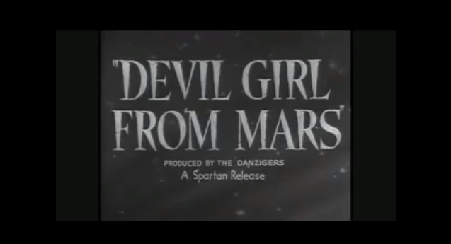

A lot of huge, slanted blocky white text as far as I've seen thus far. And quotation marks, of course. One of these fonts (or maybe a hybrid of the general look they have) will be used in places like the main menu and the interface on the upper corner of the screen where health, etc. are shown.
I've also tried out some default fonts from my computer just to see how they might look.

This is really cool! I like the first one in the second row.
ReplyDeleteYeah, that and the one right below are favorites of mine. You'd be surprised at how important it is to have an appropriate font for the text in a game! No one wants to read anything that will make their eyes bleed.
Delete