If you've been following my Dribbble account you've probably already seen me post some artwork for a game called Junk ET that I've been contributing to since January 2015. It's a roguelike about a waste removal agent who cleans up junk on various planets. The dungeons are completely randomized, so no two playthroughs are ever exactly alike. I've neglected to post about it here until now, but I'll try to change that! If all goes as planned, the final version will be released this summer. I'm working with an awesome team of people and couldn't be happier to be a part of this game.
Last week I worked with one of our programmers on one of the game's main menus. You click on different parts to access other sub-menus, like character statistics or game settings.
Different areas have some slight animation as well -- some done through code, others handled by yours truly. We want the room to feel like a lively mission control type of place where employees monitor agents like the player's character.
Here's a close up of some animation I did for the employees at the front desk.
Showing posts with label User Interface. Show all posts
FWF: Tree Indicators
Testing out more things. We needed a way to show which trees will be targeted by Creep waves (other than the dotted path, which is a bit inconspicuous at a glance). Whenever a wave begins, these white indicator arrows will clearly show where Creeps will be approaching, and if a Tree is defeated by them mid-round, the indicator will appear again to show the next targeted Tree.
Labels:
Animation,
Fire With Fire,
User Interface
Fire With Fire: Choose Your Creeps.
Online multiplayer for Fire With Fire is up and running, and it works perfectly so far. My win rate, on the other hand... less than perfect. I need more practice before the end of June, clearly.
In the meantime, we're sprucing up the visuals, because frankly, a lot of the art and visual arrangement needs to be planned out further or overdone completely. For now we're making sure the main menu, where you select your Towers and Creeps before a match, is as clear and understandable as possible.
Here's what it looks like right now.
We both agreed that this design has a few problems. Creeps are chosen in pairs, but the current layout only shows the advanced Creep that the basic one is paired with. It's important that players understand which 2 you'll be allotted in each set. It also only shows the name of one Creep instead of both.
The artwork itself is another issue. The outlines are kind of jagged, and I feel like there's too much black in the characters considering that the menu background is also really dark.
With those things in mind, I've been working on better images to place in the menu.
Much better...
The little square icons have to stay, because players need to be able to hover over them for details about each individual Creep. The white outlines are much more streamlined and clear in these versions.
Now here's something else we had to think about. How do you know which sets you've already chosen? Recall the old menu:
The top set has been selected in this screen capture. At first glance from a distance, it's kind of hard to tell. The only thing that changed was the icons grayed out; everything else in the artwork has the same visual priority as unselected sets. Could be confusing for first time players. "Did it work?"
We want the player to know without a doubt that they've chosen a set already. How do we do that?
Best thing to do is to create a stark contrast between chosen and unchosen Creep sets. In this revision, chosen sets are converted to colored silhouettes; what this does is remove detail from parts of the screen that are no longer important. Plus, there's a giant "READY" in place of the names. You don't really need to look at those elements anymore after you've picked a set, so the menu shouldn't draw your eyes there. The "READY" tag is also a different color than the Creep nametags, so that even out of the corner of your eye it looks strikingly different than unselected sets.
It... sounds more complicated than it is, but most menus and visual interfaces rely on concepts like this. Only attract the viewer's attention to where it matters, clearly separate unrelated elements, et cetera et cetera. There are many different ways to do these things.
We also want the player to know which set is currently "clicked on" before it's chosen, so we probably need some type of highlight method.
I think a dim white bar should be good enough, but some of these things are subject to change if we can come up with better solutions.
Menus probably seem kind of boring, but I hope this has given a little insight into the thought process of making sure everything's not a confusing mess. Soon I'll be doing the same things for the Towers, so I might have more similar work to share.
Labels:
Fire With Fire,
User Interface
The Only Certainty at Norwich Indie Game Expo October 11th - 12th
Alright, so a lot's been going on with TOC of course. Since the game's beta version is being showcased this weekend at Norwich Game Expo soon I figure this is a good time to catch up!
The biggest recent development is that we have a composer on board by the name of Mark Allsworth. His music is astounding to be frank, and sometimes I still can't believe we're lucky enough to be able to collaborate with such a hard working musician. He's already provided sound for the game's beta and we're just happy to have him on the team! We're really hoping he'll stick around and provide the entire soundtrack for the finished game.
Other than that, Harry and Jon have been ironing out bugs and cranking out better and better builds of the game as always. Do those guys ever sleep? I've been working on a few other assets to place in the environments and UI.
A few icons for the Galaxy Map, which is where you'll jump between Systems (think of a System as a 'room' or 'stage', you'll be exploring these throughout the game).
Additionally we have some colossal space architecture in the form of Research Stations and Drone Relays. Much bigger in game but shrunken down here to avoid crashing people's browsers.
Last but not least we've polished up the way dialogue works and looks. We've whittled it down to a text box in the lower left, where a portrait of the speaker is displayed above the text. That's Midnight, your AI companion in the story. I'll write a little more about him later in the week, but in the future I'm hoping we can implement animated character portraits as well!
I've been working on some promotional illustrations for TOC as well, which I'll show soon as well. They'll be given away at the booth on Saturday--make sure to drop by for free stuff and the chance get your hands on the beta!
Labels:
Animation,
Environments,
User Interface
Ava: Title Logo
So, every game needs a big logotype showing the title.
Not really being used to this sort of thing, I took a little time to look at other game's title logos for inspiration. But at the same time it's much like working with words/letters on anything else. Whether or not they are bold, slim, muted, colorful, close together, or widely spaced will affect the audience's perception of the game.
Not only that, but it has to communicate much of what the game is about on first glance. How can I make something that screams 'sidescrolling platformer set in a land of patchwork dolls being controlled by a sorceress who has kidnapped your significant other'?
Maybe that's a little too tall of an order. But I did want to incorporate the patchwork idea, as well as keep the overall logo bright and eye catching. It's a pretty light-hearted game all things considered.
First pass.
Trying to decide on appropriate textures at this stage, as well as an overall color scheme. The game has hints of being set in a somewhat fabricated world where things are stitched together rather than being made of natural materials, so I wanted some sort of seam or stitching in the letters somewhere. Not really satisfied with the colors/spacing, and neither was the rest of the team.
Was also trying to consider what traits the main character has that really stand out. Mario's hat and oddly shaped mustache give him away. And Sonic, well... do you know any other blue hedgehogs?
I had to take a good look at our main character and ask: at first glance, what really sets her apart from any other lead in a video game?
It's gotta be the haircut.
They say a character's silhouette should be stronger than any other detail. While I don't 100% agree, in this case I think it works. I was searching for a way to incorporate her silhouette into the logo, and it occurred to me that the little cut in her ponytail coincides with the letter V.
Second pass.
The dark blue that the letters were set against in the 1st version made too much of a contrast, so the dark tones in this one are warmer to match the reds and oranges in the letters. Decided it might be nice to incorporate part of the environment the game is set in. Included a wooden backing to match some of the buttons on the main menu. Changed up the text and made the letters myself instead of typing them out in a pre-made font, playing with negative space. Still trying to make Ava's head silhouette work, but at this point I began to second guess and question if it was forced or not. Ultimately they felt the logo was too boxy and wanted something more horizontal, so this one wasn't getting used anyway.
Third pass.
With a horizontal layout, I couldn't figure a graceful method of incorporating the head silhouette, so instead the red backpack is emphasized. No frills really on this one so it ends up feeling like a lot is missing. The texture is a bit overdone as well, losing that bright, imaginative quality and bordering on dull.
Fourth pass.
Focusing on making the environment part of the logo again. Reading left to right displays the progression of the game's levels in the background--grassland, snowy mountain, cave--to try to emphasize the whole adventure/platformer aspect. Letter stitching and texture is also back in a (hopefully) less forced manner. I've also noticed that a lot of logos have at least two outlines, one dark and one light... I assume this is done to create contrast regardless of what's behind it since these logos are often used in multiple places (game boxes, merchandise, splash screens, etc.). I think it allows readability so the logo doesn't end up getting lost on the surface it's placed on.
Fairly happy with the outcome, and the early mistakes were necessary to get to this point. Part of me wishes the head silhouette could have been incorporated somehow but maybe it's for the best. We probably don't want a female lead character who's only remembered because of what her hair looks like.
Not really being used to this sort of thing, I took a little time to look at other game's title logos for inspiration. But at the same time it's much like working with words/letters on anything else. Whether or not they are bold, slim, muted, colorful, close together, or widely spaced will affect the audience's perception of the game.
Not only that, but it has to communicate much of what the game is about on first glance. How can I make something that screams 'sidescrolling platformer set in a land of patchwork dolls being controlled by a sorceress who has kidnapped your significant other'?
Maybe that's a little too tall of an order. But I did want to incorporate the patchwork idea, as well as keep the overall logo bright and eye catching. It's a pretty light-hearted game all things considered.
First pass.
Trying to decide on appropriate textures at this stage, as well as an overall color scheme. The game has hints of being set in a somewhat fabricated world where things are stitched together rather than being made of natural materials, so I wanted some sort of seam or stitching in the letters somewhere. Not really satisfied with the colors/spacing, and neither was the rest of the team.
Was also trying to consider what traits the main character has that really stand out. Mario's hat and oddly shaped mustache give him away. And Sonic, well... do you know any other blue hedgehogs?
I had to take a good look at our main character and ask: at first glance, what really sets her apart from any other lead in a video game?
It's gotta be the haircut.
They say a character's silhouette should be stronger than any other detail. While I don't 100% agree, in this case I think it works. I was searching for a way to incorporate her silhouette into the logo, and it occurred to me that the little cut in her ponytail coincides with the letter V.
Second pass.
The dark blue that the letters were set against in the 1st version made too much of a contrast, so the dark tones in this one are warmer to match the reds and oranges in the letters. Decided it might be nice to incorporate part of the environment the game is set in. Included a wooden backing to match some of the buttons on the main menu. Changed up the text and made the letters myself instead of typing them out in a pre-made font, playing with negative space. Still trying to make Ava's head silhouette work, but at this point I began to second guess and question if it was forced or not. Ultimately they felt the logo was too boxy and wanted something more horizontal, so this one wasn't getting used anyway.
Third pass.
With a horizontal layout, I couldn't figure a graceful method of incorporating the head silhouette, so instead the red backpack is emphasized. No frills really on this one so it ends up feeling like a lot is missing. The texture is a bit overdone as well, losing that bright, imaginative quality and bordering on dull.
Fourth pass.
Focusing on making the environment part of the logo again. Reading left to right displays the progression of the game's levels in the background--grassland, snowy mountain, cave--to try to emphasize the whole adventure/platformer aspect. Letter stitching and texture is also back in a (hopefully) less forced manner. I've also noticed that a lot of logos have at least two outlines, one dark and one light... I assume this is done to create contrast regardless of what's behind it since these logos are often used in multiple places (game boxes, merchandise, splash screens, etc.). I think it allows readability so the logo doesn't end up getting lost on the surface it's placed on.
Fairly happy with the outcome, and the early mistakes were necessary to get to this point. Part of me wishes the head silhouette could have been incorporated somehow but maybe it's for the best. We probably don't want a female lead character who's only remembered because of what her hair looks like.
Labels:
User Interface
TOC: Dashboard Revision
I'm getting way behind on TOC updates.
We polished up the main dashboard where your stats are displayed.
Old version:
Newer more socially acceptable version:
In addition to just bells and whistles though we decided to give the player 20 hits before going down, not 10.
Even so, the game is still pretty hard from what I've gleaned playing the most recent builds! If you're not careful, those bars are gone before you know it.
The Power Bar's a little cleaner without the rounded end caps. Ended up causing more issues than they were worth.
There's also a new counter for Fuel Rods. Eventually I want to animate the numbers flipping downward like cards whenever you use one, as well as actually showing the Bar refilling.
Also, in case you missed it, MDNL's blog recently got an overhaul! Looking good.
We polished up the main dashboard where your stats are displayed.
Old version:
Newer more socially acceptable version:
In addition to just bells and whistles though we decided to give the player 20 hits before going down, not 10.
Even so, the game is still pretty hard from what I've gleaned playing the most recent builds! If you're not careful, those bars are gone before you know it.
The Power Bar's a little cleaner without the rounded end caps. Ended up causing more issues than they were worth.
There's also a new counter for Fuel Rods. Eventually I want to animate the numbers flipping downward like cards whenever you use one, as well as actually showing the Bar refilling.
Also, in case you missed it, MDNL's blog recently got an overhaul! Looking good.
Labels:
User Interface
TOC: User Interface Concepts
We're working on a look for UI aspects such as how much Power your ship has left, as well as the remaining Structural Integrity of the ship (pretty much like health). For the moment Power is shown at the bottom right corner so that it's out of the way and not a distraction from the main environment.
To recap a little bit, in The Only Certainty your ship uses up Power every time you travel some distance. When the Power meter runs out, you can either refill it by using a Fuel Rod (of which you have a limited supply) or choose to begin another level from the beginning (in case you want to stock up on Fuel Rods and come back later). Since this Power mechanic is almost like a timer for the player--counting down as long as you're moving--I figured a circular meter would be appropriate, somewhat reminiscent of a clock.
Another idea like a speedometer. Power's almost like gas for your car, so why not? A meter that drains from right to left instead of in a circular motion might also be a little more clear in terms of its function.
Straightforward bar. I was hesitant to use this because I think for people familiar with games it almost automatically reads as a health bar, which is separate from Power entirely in this game. Too many bars would probably be confusing.
These last 2 are essentially bars as well, just different shapes. The vertical draining motion is a little more closely tied to a tank of fluid literally running dry, but it might not really be necessary to get so literal.
They'll be labeled "Power" in the final version, but these concepts were mostly to decide on a shape that would work well and communicate a resource that is consumed by moving the ship.
There's also an actual Shield (health) meter in the game. We're going back and forth between a finer percentage based damage system, or one based on a specific number of hits. The following concepts are based on the latter.
So in this sketch, your ship would be able to take 12 hits before getting a game over. A single square would darken each time you take damage.
Similar concept, except all of your hits are lined up in a row and the current hit point is enlarged for emphasis. May add some kind of blinking or pulsing animation when you only have one hit point remaining.
This is the kind of health system you see in games like Super Mario 64/Sunshine/Galaxy. Kind of a pie shaped deal.
Ideally, Power and Shield won't be floating haphazardly on the screen like this; the plan is to tie them together with some kind of dashboard or bar along one edge of the screen once the game is developed a little more. I'm hoping to do a little more research on 50s sci-fi movies to dig up ideas on how a dashboard from that era might have looked.
To recap a little bit, in The Only Certainty your ship uses up Power every time you travel some distance. When the Power meter runs out, you can either refill it by using a Fuel Rod (of which you have a limited supply) or choose to begin another level from the beginning (in case you want to stock up on Fuel Rods and come back later). Since this Power mechanic is almost like a timer for the player--counting down as long as you're moving--I figured a circular meter would be appropriate, somewhat reminiscent of a clock.
Another idea like a speedometer. Power's almost like gas for your car, so why not? A meter that drains from right to left instead of in a circular motion might also be a little more clear in terms of its function.
Straightforward bar. I was hesitant to use this because I think for people familiar with games it almost automatically reads as a health bar, which is separate from Power entirely in this game. Too many bars would probably be confusing.
These last 2 are essentially bars as well, just different shapes. The vertical draining motion is a little more closely tied to a tank of fluid literally running dry, but it might not really be necessary to get so literal.
They'll be labeled "Power" in the final version, but these concepts were mostly to decide on a shape that would work well and communicate a resource that is consumed by moving the ship.
There's also an actual Shield (health) meter in the game. We're going back and forth between a finer percentage based damage system, or one based on a specific number of hits. The following concepts are based on the latter.
So in this sketch, your ship would be able to take 12 hits before getting a game over. A single square would darken each time you take damage.
Similar concept, except all of your hits are lined up in a row and the current hit point is enlarged for emphasis. May add some kind of blinking or pulsing animation when you only have one hit point remaining.
This is the kind of health system you see in games like Super Mario 64/Sunshine/Galaxy. Kind of a pie shaped deal.
Ideally, Power and Shield won't be floating haphazardly on the screen like this; the plan is to tie them together with some kind of dashboard or bar along one edge of the screen once the game is developed a little more. I'm hoping to do a little more research on 50s sci-fi movies to dig up ideas on how a dashboard from that era might have looked.
Labels:
User Interface
Fire With Fire: Pillars and Blockades
Working on new icons for FWF (actually, we already had the Rock sprite, but I hadn't made a selectable icon for it yet). You can set Rocks onto the field to obstruct where oncoming ground-based Creep waves can move, but you can also upgrade the Rocks into tall Pillars, which will be able to block the path of even flying Creeps. I made 3 different versions of the Pillar to sort of get a feel for what it should look like, we'll probably go with the square one.
Since the game is shown in a top down perspective, it's kind of hard to convey how tall Pillars are by looking at the sprite. In this case I thought it was more important to show that it was some kind of impassable stone obstacle, and for it to have the same color scheme as the Rocks to show that they're in the same 'family'.
Threw together a little mockup to see how they'd look in the game here.
Labels:
Fire With Fire,
User Interface
Dialogue Boxes and Fonts from the 1950s.
A little something I threw together for The Only Certainty. We're trying to figure out how dialogue will take place onscreen when the player scans a monitor, or interacts with another character.
We discussed the idea of having a little headshot of whoever (or in this case, whatever) is speaking. Adds a little personality, a lot of other games do this as well.
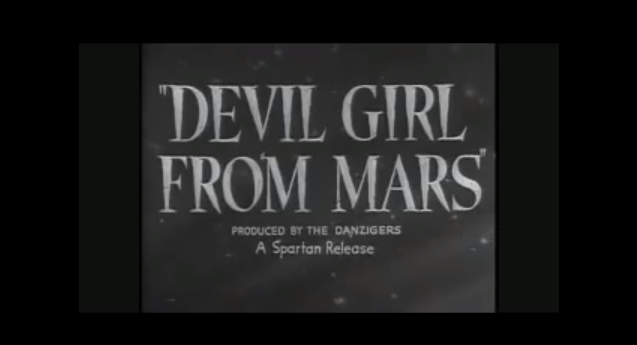
We're also looking at the kind of fonts we want to use for things like dialogue, the main title, and other important areas in the user interface. Looking at old 1950s sci-fi movies has helped in figuring out the direction we want to go for the game's typefaces:
A lot of huge, slanted blocky white text as far as I've seen thus far. And quotation marks, of course. One of these fonts (or maybe a hybrid of the general look they have) will be used in places like the main menu and the interface on the upper corner of the screen where health, etc. are shown.
I've also tried out some default fonts from my computer just to see how they might look.
We discussed the idea of having a little headshot of whoever (or in this case, whatever) is speaking. Adds a little personality, a lot of other games do this as well.
We're also looking at the kind of fonts we want to use for things like dialogue, the main title, and other important areas in the user interface. Looking at old 1950s sci-fi movies has helped in figuring out the direction we want to go for the game's typefaces:
A lot of huge, slanted blocky white text as far as I've seen thus far. And quotation marks, of course. One of these fonts (or maybe a hybrid of the general look they have) will be used in places like the main menu and the interface on the upper corner of the screen where health, etc. are shown.
I've also tried out some default fonts from my computer just to see how they might look.
Labels:
Miscellaneous,
User Interface
Fire With Fire: New Weapons, New Creeps
It's been awhile since I've mentioned this project, but recently we worked on adding a few new features to Fire With Fire-- 5 new weapons and 4 new types of Creeps to attack your enemy with. Just like before I was asked to create icons and weapon sprites to be implemented into the game.
I was given the chance to try out the current build of the game before Christmas; the gameplay is amazing so far. And I'm not just saying that because I helped work on it! If all goes well, though, I believe in the near future a lot more people are going to get the opportunity to try it out for themselves. Hint hint. As always, keep an eye on Theory's development blog for progress updates.
Labels:
Fire With Fire,
Miscellaneous,
User Interface
Subscribe to:
Posts (Atom)