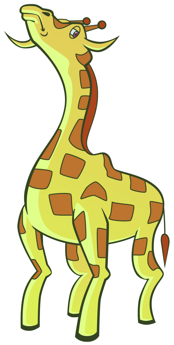
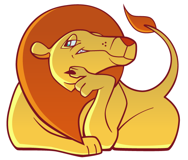
Actually, it's kind of strange making artwork that's supposed to be geared towards kids. I guess for me it's hard to think in terms of artwork that 'kids will like', since all kids are different just like adults. I also notice in a lot of kids programming, often times most of the characters are smiling all of the time. I don't know the exact reason for this, but the most obvious answer seems to be that the adults who create the content want to give younger kids a brighter, optimistic outlook on whatever they're being exposed to. Until they get old and jaded like us, that is.
It's been a while since I've worked in Illustrator for finished work. Part of the issue with some of my recent character work for this project has been the outlines, so I was working on a way to add variation to the line width as well as thin them out towards the edges. I believe I read that in CS5, there's actually a built in function that allows you to control line thickness of a single stroke, but since I'm using CS4 I had to figure out a slightly more old-fashioned approach. Jumping straight into Illustrator is a bit awkward for drawing the basic foundations of a character (for me anyway), so rough sketches are always handled on paper/in Photoshop. The sketches were traced over in Illustrator with a basic 5 pt line (or 3 for smaller details), and from there I used the Outline Stroke Function to turn the lines into shapes. From there I could pull on anchor points to pretty much regulate the lines' thickness to any degree I wanted. Not sure why I didn't think to do this sooner since it seems pretty obvious, but... yeah. It just feels more accurate than creating a new brush that tapers off towards one end.


No comments:
Post a Comment